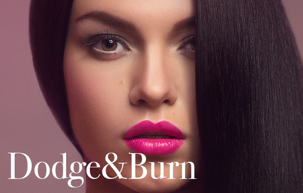
Dodging and Burning is a method of lightening and darkening specific areas of an image, regulating local exposure to even out texture and contours. It digitally acheives (and with much more control) an old darkroom technique of witholding light (dodging) to keep an area light, or increasing the exposure to darken (burn) areas.
You’ll find the dodge and burn tools on the toolbar to the left of the default Photoshop setup, or by pressing ‘O‘.
The problem with using the standard tools is that they work destructively, they won’t operate on a blank layer so you’ll be making permanent changes to your working layer. This would be fine if none of us ever made an error or changed our minds, but to give us the option, we have a couple of methods available.
I split my workflow into two parts, pixel level dodge and burn, and carving. For pixel D&B I use the Curves method outlined below to even texture whilst zoomed in from 100% to 400%. Carving is more about shaping the contours of the face and enhancing contrast, and I like to work at 50% view or less to keep the whole image in context. I often do this second step on a 50% grey layer, my own preference and the choice is ultimately up to you.
The Curves Method and Pixel D&B
You can do this a number of ways using a number of other adjustments, but the premise is this; you increase lightness using an adjustment layer, you mask it out with black, and on the mask you can then paint the effect back into the required areas with white. You decrease lightness on a different adjustment layer and treat it the same way. Others may use different adjustments for this, I use Curves which is why I’ll explain this method here. I’ll be using RGB, and the following assumes some familiarity with curves, masks and adjustment layers.
Open a Curves adjustment layer and with a single point pull the midtones up, this will be your dodge layer;

Fill the mask with black, hiding the effect of the curve (by default the mask should be selected and pure white, so just hit Cmd/Ctrl+I to Invert);

For the burn layer, start a new Curves adjustment and pull the midtones down with a single point;

Invert the mask and name this layer Burn;

Paint with a soft white brush onto the Burn mask to darken, and the Dodge mask to lighten.
My preference is to use a low Flow setting, between 1% and 5%. Many use Opacity but I prefer the ability to build up the effect in one stroke instead of lifting the pen.
This is a composite of the two masks after dodging and burning, coloured to distinguish the lightened areas from the burned, and the result;

Carving and 50% Grey
The next part of my workflow involves adding contrast and contour to shadows and highlights. To demonstrate this using the 50% grey layer method, select Layer>New>Layer and in the resulting dialog box select Mode: Soft Light and check the box next to ‘Fill with Soft Light neutral color (50% gray).
You can paint onto this layer with black or white, or indeed any colour but as we’re dealing with luminosity stick to black and white. Again using a soft brush with a low Flow/Opacity zoom out so you can see the whole image or most of it, and you can accentuate the shadow and highlight or even alter the appearance of shapes. Remember that generally, lightening an area makes it appear closer, darkening helps it to recede.
In the below example, I’ve also selected the whites of the image (using Select>Color Range) and filled them with white to accentuate the highlights further.

Read Part 2
Please feel free to share this tutorial, and if you have any questions please post them below.
Danny
Hi Daniel! Thanks for D&B Tutorial. I found it easier to follow than other tutorials I have seen on the subject. Before seeing this tutorial, I had ended up doing dodge and burn my own way and I was wondering what your thoughts on this would be. I actually duplicate the original layer and use the dodge and burn tools on the duplicate painting with highlights for dodge and shadows for burn. If I make any mistakes, I clone stamp the original layer and go over the duplicate with a soft brush to restore the area I want to clean up. Is this an acceptable method? I am fairly new to retouching and hope to get a job doing it in the (hopefully) near future, so I wanted to hear from a professional like yourself. Thanks!
Hey
Exellent work!
I wonder how much time you approximate spend on a The Curves Method and Pixel just for one photo.
I guess is what a lot of work:)
Thanks in advance for reply .
Sasha
Excellent tutorial : very professional. Nothing to compare to most tutorials online.
Many thanks !
Hi Daniel,
I liked your work very much. The way you get the perfect skin and texture is very impressive. I am a beginner and learning Photoshop i tried to get the skin the way you do but i am not able to get it. I have a request could you please send any of your PSD file (Low res file will do) so i can learn from it in detail. waiting for your reply.
Thanks,
Shiva
Hello Daniel,
I know that for most users it’s best to dodge and burn using a pressure sensitive tablet but could You suggest brush settings for a mouse (opacity, flow, brush toolbar) ? I also know that there’s no one accurate answer but it’d be good to have a point of reference to start before I buy a tablet.
I get strokes that are too light so I think I should lower the opacity.
Thank You in advance.
A good starting point for me was 30 % flow and 30% opacity , later you can adjust it by you preferences.
(sorry for my bad english)
This was really helpful. Always comforting to discover a clever non-destructive work flow! Thank you!
How do I add blue and red effect to distinguish between the dodge and burn.
I believe I just clipped a normal layer filled with red and cyan respectively to each of the curves layers.
This was really helpful, thank you
Muy buen tutorial y muy sencillo de poner en practica,felicidades!!
thank you
Great work.
Can you share the original image file ? So we can try on this image
Hi Andrea, I’m afraid I don’t have it anymore, but the techniques apply broadly to beauty skin work. Good luck with practicing! 🙂
Cool Technique=) I use a technique where you make a new layer filled with 50% gray set to either softlight or overlay and then paint at 3%flow with black or white paint brush-I find it very effective as well, but I’m curous how this would help when you need to build harder contrast. Thanks for the great tutorial=)
You’re welcome Joey! I need to update it a little bit I think, I’d write a new one but this guide seems to get a lot of traffic!